
Web/mobile push: Subscription forms
Web push
Effective subscription form
There are two types of subscription forms that can be implemented on your website when enabling web push notifications:
- default (single opt-in when paired with the integration with own domain, double opt-in with basic integration)
- custom (always double opt-in )
Default subscription form
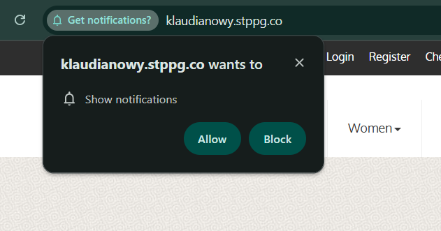
In the integration with own domain, this form comes from the browser itself. It is simple, the most common, and requires only one click to complete the subscription. You cannot change its appearance or content, but you can choose when it appears and on which sections of your website (see subscription form behavior below).
The language of the form will be automatically changed to the language set in the user browser.
The default single opt-in subscription form can generate up to 10× more subscribers than a double opt-in form. This insight comes from PushPushGo clients' projects that tested both approaches over several weeks, comparing daily subscription rates before and after the switch.
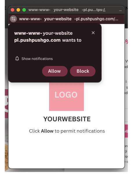
In the Basic integration, this form is implemented as a double opt-in. The first prompt looks similar to the one above; however, you can customize its appearance and content - it is no longer generated by the browser, but by PushPushGo.
In this integration, we host your service worker, so the default single opt-in prompt provided directly by the browser is not available. After the user accepts the first prompt, a confirmation window is displayed, where the native browser prompt appears.
You can edit your confirmation window in Integration > Web Push > Settings > Confirmation Window. The elements you can modify include:
- icon
- description
Custom subscription form
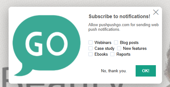
You can fully customize your subscription form (you can even add notification topic selection for users). However, this results in a double opt-in subscription process. After accepting the custom form, the user will see the default subscription prompt (or a confirmation window, depending on your integration setup), which must also be accepted. The second step is the one that actually saves the subscription.
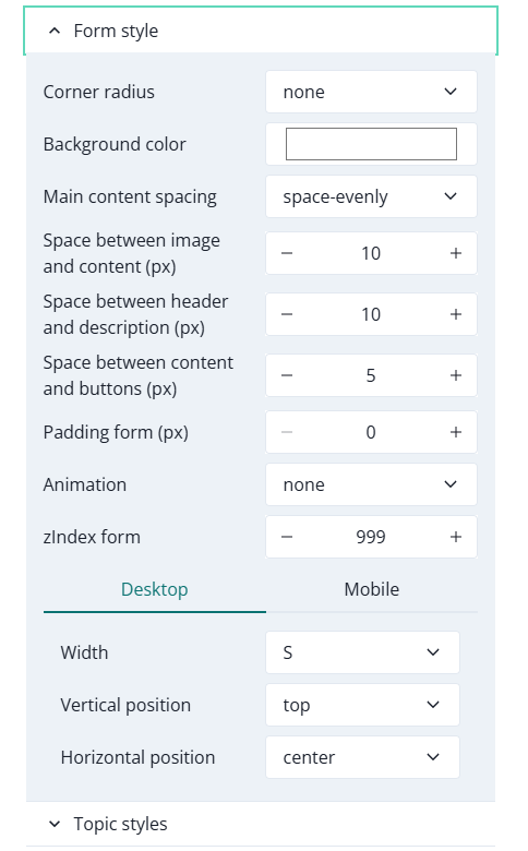
Subscription form creator
This option can be found in Integration > Web Push (VAPID) > Subscription Form.
It provides full customization options for your subscription form if you choose the custom double opt-in approach. You can modify the shape, placement, content, fonts, colors, backdrop, and more.
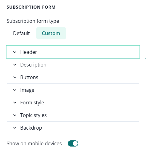
You can use the Full Desktop Preview option to see how the form you just created will look on your website.
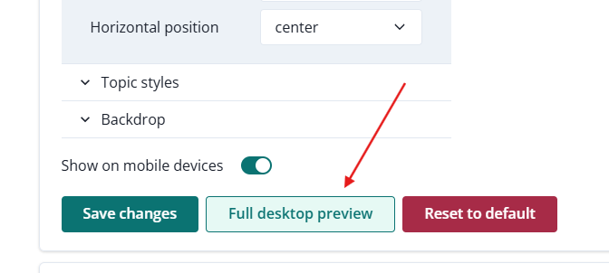
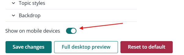
You can also decide whether to show the form on mobile devices or not.
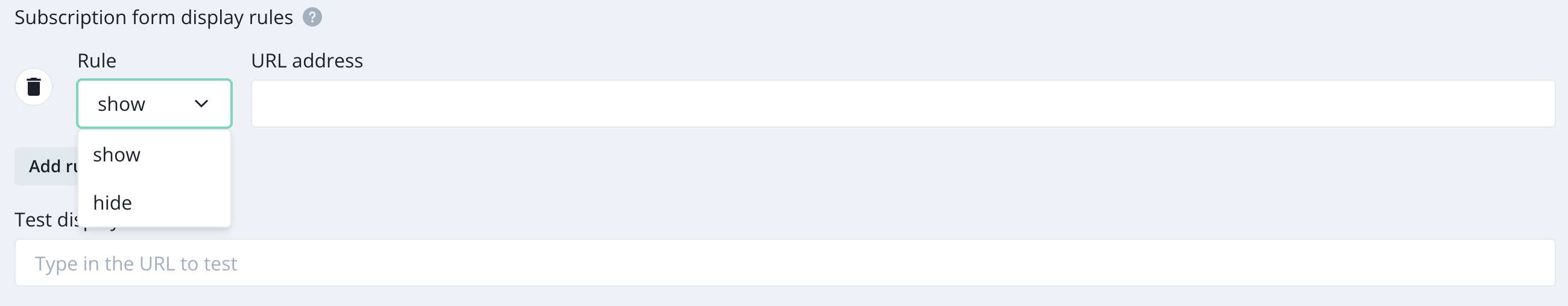
Subscription form behavior
Choose where and when subscription form will be shown on your website.
Go to Integration > Web Push (VAPID) > Settings > Form display
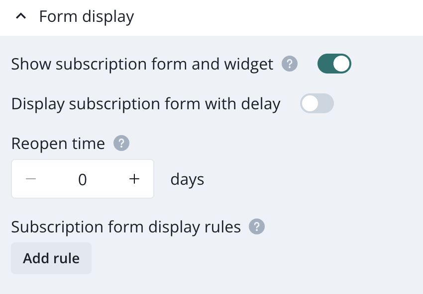
You can specify which URLs the subscription form should be shown on or hidden from.
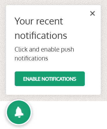
Bell Widget
The bell widget is another way to promote signups. After clicking the bell icon on a page, a pop-up appears, inviting the user to subscribe.
To enable and configure the Bell widget, go to the Integration > Web Push > Bell Widget. Here, you can customize the text displayed to users, the color of the bell icon, and the button text.
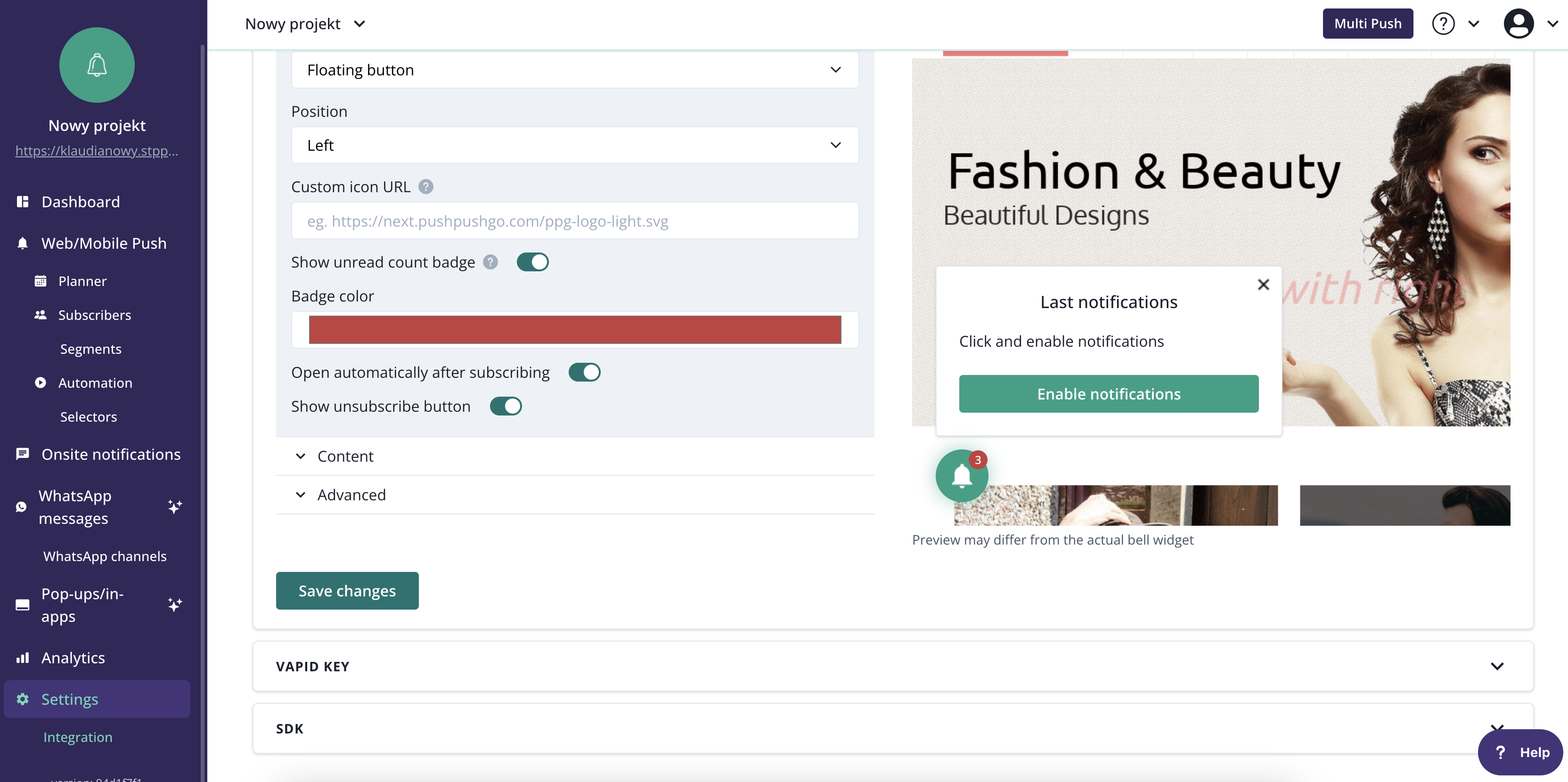
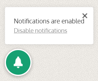
Users who have not yet subscribed will see a message encouraging them to do so. After signing up, a confirmation box will appear, also providing the subscriber with an unsubscribe link.
Mobile push
iOS
System Permission Prompt (OS-Controlled)
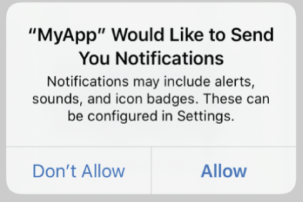
On iOS, push notifications can only be authorized through the native Apple permission dialog. This prompt appears when the app calls requestAuthorization.
Important constraints:
- The system prompt cannot be customized
App owners cannot modify:
- Colors or layout
- Button labels (“Allow” / “Don’t Allow”)
- Title or descriptive text
- If a user denies permission, the system prompt cannot be shown again. The user must manually re-enable notifications in the device’s Settings.
Because of these restrictions, the main opportunity lies in preparing the user with a pre-permission experience.
What you can customize?
1. Custom pre-prompt screen
A pre-prompt is an in-app modal, screen, or banner shown before the OS prompt.
This screen is fully customizable and can explain the value of enabling notifications.
Typical elements include:
- Benefits list (“Get delivery updates”, “Receive account alerts”)
- Visuals, icons, or sample notification cards
- Call-to-action: “Enable Notifications”
- Secondary action: “Maybe Later
Upon user acceptance, the app triggers the system permission dialog.
2. Contextual permission requests
Instead of asking on first launch, apps can ask at meaningful moments, such as:
- After a user favorites or follows something
- After placing an order and expecting updates
- During onboarding after key value has been demonstrated
This approach often results in significantly higher opt-in rates.
3. Reminder banners or In-App messages
If a user declines your pre-prompt (not the system prompt), you can show lightweight reminders later in the experience.
Examples:
- A small card in a relevant screen
- A tooltip explaining what notifications enable
- A subtle banner prompting re-engagement
4. Post-denial flows & Deep-link to settings
If the user denied the system prompt:
- The app can detect that permission is denied
- You can present a “How to Enable” screen with a button that links directly to iOS Settings for your app.
This is the only way for the user to re-enable notifications after denial.
Android
Android behavior differs depending on OS version.
Android 13+
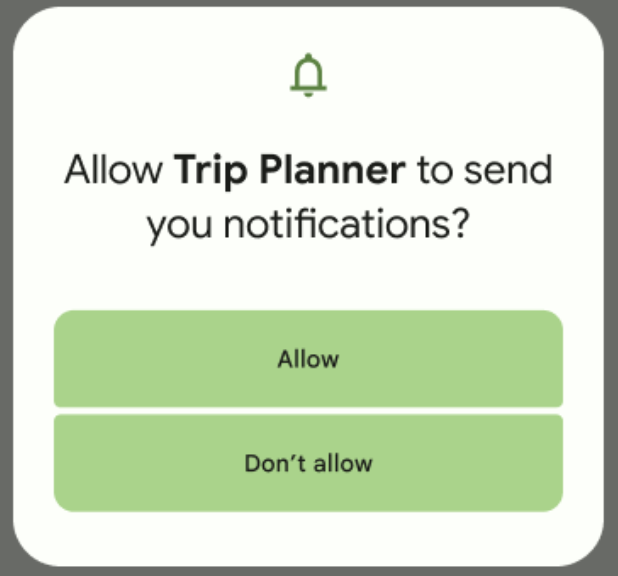
Android 13 introduced a dedicated runtime notification permission similar to iOS.
System prompt characteristics:
- Triggered when requesting the POST_NOTIFICATIONS permission
- Cannot be redesigned or reworded
- User choices: typically “Allow” / “Don’t Allow”
Restrictions are similar to iOS: the system dialog is fixed, and your design must occur around it.
Android 12 and below
For older versions:
- Apps are allowed to send notifications by default after installation.
- Users can still disable notifications manually in system settings.
- UX around “enabling” notifications becomes more about education and category selection rather than technical permission.
What you can customize?
1. Custom Pre-Prompt or Explainer Screen
Just like on iOS, you can build a fully custom UI to explain why notifications are helpful. If running on Android 13+, this leads to the system prompt. Below Android 13, it simply toggles a logical preference in your app.
2. Granular Notification Preference Center
Android supports Notification Channels, allowing users to control categories individually.
Common pattern:
- Create an in-app settings screen listing categories (e.g., “Order updates,” “Recommendations,” “Security alerts”).
- When the user enables a category:
- Show your explainer (if permission not granted)
- Trigger the system permission dialog (Android 13+)
- Configure or update notification channels
This gives the user meaningful control and aligns well with platform expectations.
3. Contextual or Event-Driven Requests
Ask at moments that logically justify notifications:
- When the user opts to “track” an item
- After placing an order
- When following a creator or subscribing to a topic
This reinforces value and reduces perceived spam.
4. Post-Denial Re-Enablement Flow
If users deny permissions or turn channels off:
- Show an educational screen explaining the benefits
- Provide a “Open Notification Settings” button linking to system settings
This is the only fully reliable way to let users re-enable them.